Strategic Analysis & Visualization
real-time service desk dashboards - broadcom



Problem
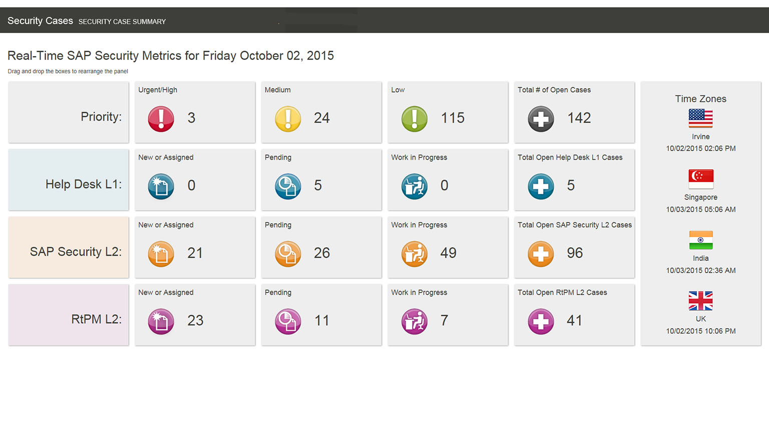
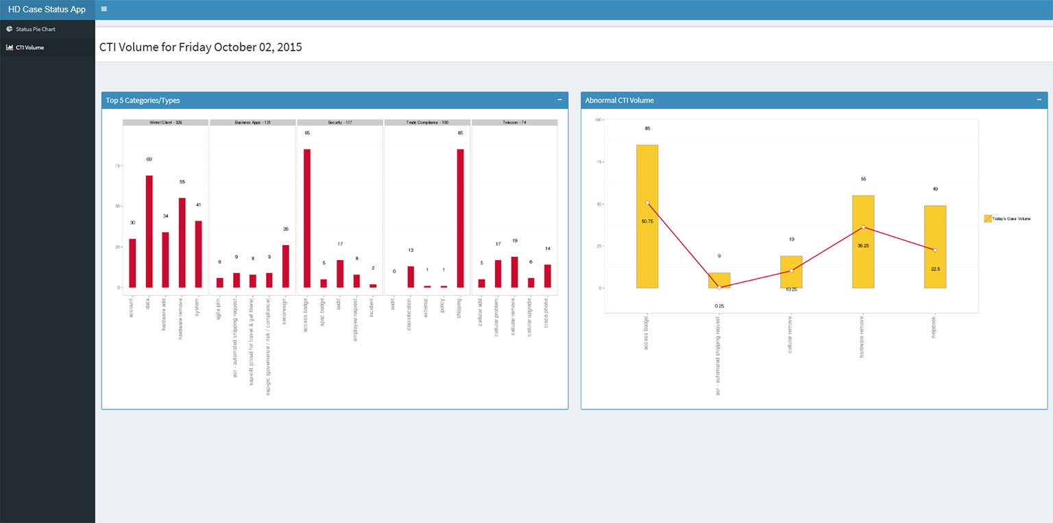
In order to improve customer service, service desk managers wanted to quickly see the case volume, and other call and email case Statistics.
Solution
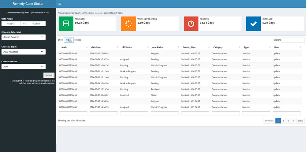
I created dashboards that provide easy-to-read graphical representations of the current status and past historical trends of key Performance indicators (KPIs). With a practical and user-friendly design, these presentations enable users to make instant and informed decisions at a glance.
Details
These applications are built in Shiny. R and SQL were used to retrieve, process, and analyze the data. The interface utilizes HTML, css. bootstrap and gridster. See part of the code for the Service Desk Dashboard